Friday, 7 June 2013
Friday, 17 May 2013


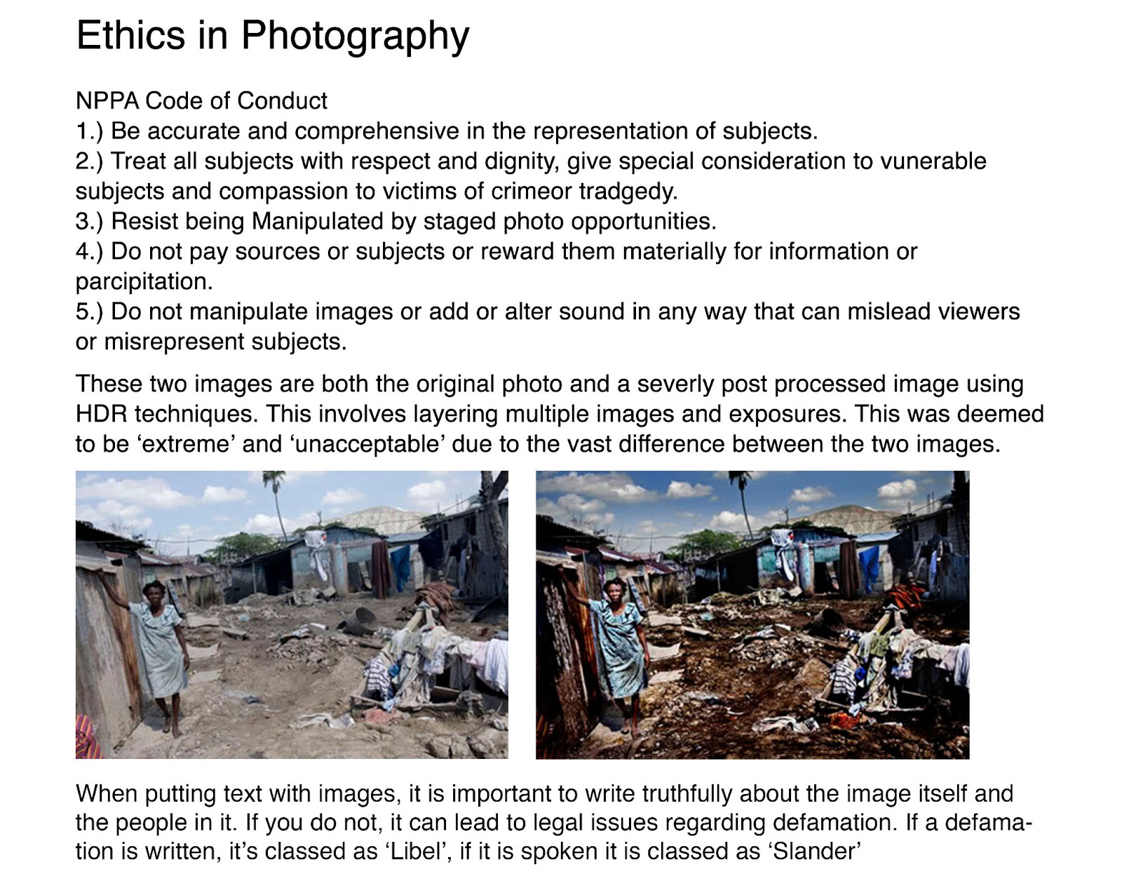
Scanning Colour Negatives
When scanning 35mm negatives into the computer, you must scan at a much higher resolution such as 1200dpi, to ensure a good quality image.
Once I had scanned the negatives I had to clean them up. To clean up the scanned images I used the Spot Healing Brush tool, this enables you to remove dust or scratches from your image simply and easily.

This is the image before.
 I then drew over the affected area.
 This is the result.

This is the image before I removed all dust and scratch marks.
 This is the image after I removed the dust and scratch marks.

Once I had scanned the negatives I had to clean them up. To clean up the scanned images I used the Spot Healing Brush tool, this enables you to remove dust or scratches from your image simply and easily.
This is the image before.


This is the image before I removed all dust and scratch marks.
 This is the image after I removed the dust and scratch marks.
Friday, 10 May 2013
Panoramic Images
Next, go to File > Automate > Photomerge

After this click the Add Open Files tab, as seen below.

You can then choose different ways you want Photoshop to stitch the images together, once this is selected click Okay.


This is my own 360 degree

This is a further experiment I produced from the 360 Degree Panorama.

Thursday, 9 May 2013

Wednesday, 1 May 2013
Studio
David Bailey
The photographer
I am going to be looking at is David Bailey. Bailey is regarded as one of the
best British Photographers and has photographed some of the most influential
people all around the world. Bailey is known for his high contrast studio
portraits, using high key lighting set ups with simple white backgrounds,
creating a stark contrast between the subject and the background.


This image depicts Lord Snowdon. This shot uses a simple lighting set
up named after the famous artist Rembrandt, due to his use of this lighting
effect in many of his paintings. This lighting is successful as it creates
strong shadows on the subjects face whilst ensuring both of the subject’s eyes
are clear and bright, hence therefore giving the subject life and bringing the
image alive. An easy way of
distinguishing this lighting set up from others is the triangle shape of light
under the subjects left eye. This lighting set up is named after the artist
Rembrandt, due to his use of this kind of lighting in his paintings.
Here are some more examples of Baileys portraiture.


The first image at the top is an example of ‘Butterfly Lighting’, note the butterfly shaped shadow under the nose of the subject. The image in the center also uses this lighting set up. The final image uses lighting set up called ‘Split lighting’; this is where only half the face of the subject is lit up.
These images below, are my images from the studio attempting to replicate three different types of studio lighting.
This first image is an example of short portrait lighting, this is when the key light is coming from the short side of the subject and the broad side of the face is in shadow.
This first image is an example of short portrait lighting, this is when the key light is coming from the short side of the subject and the broad side of the face is in shadow.

This second is an example of Broad Portrait Lighting. This is when the key light is lighting the broad side of the face.

This final image is an example of Rembrandt Portrait lighting, notice the triangle shape under the right eye of the subject, this is because the shadow from the nose connects with the shadow on the side of the subjects face.

For my self-portrait I would like to use either a Broad Portrait Lighting set up or a Rembrandt Portrait Lighting set up. I would also like to keep the overall lighting quite low key and ensure the eyes of the subject are lit well.
Self Portraiture
Vivian Maier
The image (below) was taken by Vivian
Maier. I chose this image because of the interesting use of
reflection, unlike her other self-portraits, which used quite obvious
reflections in mirrors, this one creates a subtle, atmospheric effect. Furthermore
I really like the way she has managed to include the urban landscape in the
background, once again not obvious but still included to add more sense of
depth to the overall image. This then creates a feeling that she is part of the
image, rather than the image being about her. This also gives a bit of
background information to where the image was taken, due to the distinctive
streets and buildings.

I also believe this image
is successful because of the use of a medium format film which creates a square
crop, making it much easier to focus in on Maier, ensuring she doesn’t seem
lost in the landscape.
Another point is I like the inclusion of another person in the
background, this brings a sense of reality to the image, once again making her
seem like part of the image rather than separated completely. Furthermore this
inclusion of another person creates more atmosphere by juxtaposing with the
unworldly reflection, the combination of distortion and reality works
incredibly well in this self-portrait, once again adding such depth and
atmosphere, which isn’t apparent from the start.
This image below is my outcome for my Self Portrait.
.jpg)
Firstly, I decided to use a Rembrandt Portrait Lighting set-up. This involves using a key light, 45 degrees from the subjects face as well as another light to subtly light the backdrop. By lighting the backdrop it enables you to easily distinguish the backdrop from the subject, which can get confusing when using low key lighting set-ups. The lights I used were tungsten lights, therefore without flash I had to use an ISO of 800 to ensure a correctly exposed image. My equipment consisted of a Nikon D3100 with a 50mm prime lens, set to an aperture of 1.8 with a shutter speed of around 1/400 of a second. I also used a tripod and a diffuser over the key light to soften the otherwise harsh light. In post production I desaturated the RAW file and increased the contrast and highlights to even out the skin tone and really emphasize the eyes. Furthermore I wanted to emphasize the triangle shape under my left eye.
This image below is my outcome for my Self Portrait.
.jpg)
Firstly I believe this image is successful. I believe this because of the use of the Rembrandt lighting set-up which has worked well. It is also successful as I have managed to ensure both the eyes are well lit, without this the image would not work as well. I am also quite pleased with the focus point, due to using such a wide aperture of 1.8 it was possible that i would focus on certain features of the face and not others, but by distancing myself correctly from the camera I managed to focus on the eyes and the face but gain some kind of depth of field on the shoulders and backdrop.
However, although the lighting set-up has worked well, I believe that the shadows and highlights could be cleaner. By this I mean capturing a much cleaner and definitive lines between highlights and shadow. I also believe that the overall image could have been composed better, by placing myself in the center the image seems a bit obvious and lacks depth which could have been achieved by experimenting with compositions and angles.
Another point is that I'd like to light the backdrop much more to gain a more distinguishable area from the subject to the backdrop. If I were to shoot this again, I would like to shoot it in 35mm film and experiment much more with the back light but not so much the key light as I believe this was relatively successful.
I believe that this image has fulfilled the brief as I have managed to create a self-portrait using studio lighting in a successful way. I have also managed to create an image with a sense of depth and atmosphere by using the Rembrandt Lighting technique.
Shoes
These images below are all taken from Flatspot's Blog. Flatspot is a company that produces there own clothing as well as selling other commercial brands such as Nike, HUF and Vans. This is the link to their blog: http://www.flatspot.com/blogs/flatspot-blog
Firstly I chose this image because I really like the short depth of field which separates the shoes and the clothing from the background. Without this shallow depth of field the image could have been too busy due to the contrasting lines in the floor compared to the bench. Furthermore the use of quite bland, neutral colors really helps the shoes stand out.
 This Second image is also taken from the same blog. I like this image because of the really strong lighting that highlights elements of the shoes and not others, this gives a much more subtle effect and lets the shoes speak for themselves. Furthermore I believe the composition is successful as once again it gives out a reserved quality which is hard to achieve. At the same time, by placing the subject in the center it challenges the rule of thirds and adds another dimension.
 However, when photographing my own shoes I am going to be using a studio with flash lighting. This therefore will give a much different effect. I aim to use challenging compositions and shallow depth of field to emphasize the shoes themselves. I am also choosing to photograph the shoes when there on someones feet as it gives the shoes much more shape and meaning. When Photographing I am aiming to distance myself from the subject and experiment with the key light to gain some interesting lighting and shadows.
Outcome
This is my outcome. For this shoot I used flash lamps. I used a single flash head with a small soft box to diffuse the light relatively evenly. The light was angled directly in front of the subject and the backdrop. To shoot I used a Nikon D3100 with a Nikkor 50mm 1:1.8 prime lens. The settings I used were an ISO of 100, a shutter speed of 1/125 and an aperture of F8. In terms of post production, I made simple adjustments in Adobe Lightroom to firstly DE-saturate the image and then to increase the highlights and shadows.
When shooting I decided to shoot at an angle, I did this to gain a subtle shadow which filled the background. I also wanted to experiment with negative space to give the image an extra aesthetic quality. However I ensured that the angle wasn't too great as this would have broken the clean line between the subjects legs, meaning the image could have felt too unbalanced and heavy. By including the legs in this image I believe it gives the image an overall ground, rather than just a pair of shoes it gives the image slightly more depth and meaning. This was aided by the low angle at which the image was shot, almost completely detaching the viewer from the person without detaching the viewer from the subject entirely.
 Overall I believe this image is successful, however there a few things I would change to enhance the final outcome. Firstly I would like to use a much harder light source, this would have made the final outcome much more dramatic and powerful. I would also have liked to include more people or objects in the background of the image to add a bit more depth and quality. Finally I would like to use a very open aperture of around 1.8 to completely blow out the background. However, this is not possible when shooting with flash heads without the use of a ND filter or Neutral Density filter. An ND filter basically stops as much light entering the camera, so by using this it would enable me to use much wider apertures without over exposing the image completely.
Fruit
This image was taken by Lou Manna, a commercial photographer who specializes in photographing food. I chose this image because of the vibrancy and color. I really like the way that the colors have been used in this image, by placing the apple in that position the green leads your eye round the apple itself and into the opposite side. I also really like how the composition juxtaposes with the unbalanced color of the apple. I believe that the focus point in this image, helps it to be so successful, rather than focusing at the front of the apple, Manna has chosen to focus on the leaf, the crisp texture of this leaf then contrasts with the apple itself adding much more depth to the image.

Outcome
I have two final outcomes from this shoot. Here are the techniques and processes I used.
Firstly I decided to use tungsten lighting for this as I wanted to produce a much more dramatic final outcome. I used two tungsten lights, one to subtly light the backdrop and one to light the apple itself. The key light had a diffuser attached as well as both lights having blue gels attached, the blue gels are used to compensate for the warmth of the tungsten lights. When shooting I used an ISO of 1600, an F stop of 5.6 and shutter speeds ranging from 1/50 of a second to 1/80 of a second.
Here are the contact sheets from the shoot.


 Firstly, I chose this image because I really like the minimal use of lighting, I believe this creates drama and atmosphere. This is aided by the harsh lighting which creates very small areas of light and throws the rest of the image into shadow. When lighting this image I used a key light, which was about 45 degrees from the position of the camera. then used the second light to subtly light the backdrop from the right. By lighting the backdrop it gives the overall image some structure, breaking up the large proportion of black.
The color is extremely important in making this image successful, the way the color is contained by the dark shadows.
Hands
This image was taken by Jerry Uelsmann. In this image I am focusing on the lighting used to depict the hands, not the elaborate sandwiching techniques.

Firstly, I chose this image because of the strong depth to the lighting, the deep shadows which almost bleed into the form and shape of the hands. In contrast to this, the whole image is completely sharp and in focus, this juxtaposes with the deep, soft, shadows and creates complex lines and detail within the hands. This therefore gives the image a much more powerful effect. By retaining the detail in the hands, it really adds character and suggests a lot more about the subject, which I believe is important.
This image has been lit using flash, hence the really crisp, sharpness to the image. I will also use flash in my image, along with a large aperture of around F8 or F11 to ensure the entirety of the subject is in focus and sharp.
The light in this image is directed slightly from the left side of the image, this therefore creates much longer, darker shadows.
This is the contact sheet from my initial shoot, I lit the subject with a single flash head. I used a honeycomb snoot for more of a harsh lighting, this would ensure strong and deep shadows. I lit the subject from different angles and experimented with composition.
The equipment I used consisted of a Nikon D3100 with a Nikkor 50mm No AF prime lens. I used an aperture of F16, a shutter speed of 1/125 and an ISO of 100.

This is my final outcome.

For this image I simply desaturated the RAW file in Lightroom and enhanced the contrast slightly to help bring out the textures and detail in both the hands, and the shadows.
Firstly, I am overall quite happy with the outcome of this image, although there are a small number of things which I plan to change to enhance and improve the outcome. To enhance this image I plan to capture a much more balanced and symmetrical image, I believe this will create much more atmosphere. Another point is, I like the use of shadow in this image although I believe the lack of detail in the shadowed areas hindered the overall presence of the image.
This is the contact sheet from a second shoot I did, I believe this shoot is much more successful than the first, as I refined my ideas into a much more successful outcome.

This is my final outcome from my second shoot. I am very pleased with this image as I believe it conveys a much stronger character whilst remaining quite graphic.
However, although the lighting set-up has worked well, I believe that the shadows and highlights could be cleaner. By this I mean capturing a much cleaner and definitive lines between highlights and shadow. I also believe that the overall image could have been composed better, by placing myself in the center the image seems a bit obvious and lacks depth which could have been achieved by experimenting with compositions and angles.
Another point is that I'd like to light the backdrop much more to gain a more distinguishable area from the subject to the backdrop. If I were to shoot this again, I would like to shoot it in 35mm film and experiment much more with the back light but not so much the key light as I believe this was relatively successful.
I believe that this image has fulfilled the brief as I have managed to create a self-portrait using studio lighting in a successful way. I have also managed to create an image with a sense of depth and atmosphere by using the Rembrandt Lighting technique.
Shoes
These images below are all taken from Flatspot's Blog. Flatspot is a company that produces there own clothing as well as selling other commercial brands such as Nike, HUF and Vans. This is the link to their blog: http://www.flatspot.com/blogs/flatspot-blog
Firstly I chose this image because I really like the short depth of field which separates the shoes and the clothing from the background. Without this shallow depth of field the image could have been too busy due to the contrasting lines in the floor compared to the bench. Furthermore the use of quite bland, neutral colors really helps the shoes stand out.


Outcome
This is my outcome. For this shoot I used flash lamps. I used a single flash head with a small soft box to diffuse the light relatively evenly. The light was angled directly in front of the subject and the backdrop. To shoot I used a Nikon D3100 with a Nikkor 50mm 1:1.8 prime lens. The settings I used were an ISO of 100, a shutter speed of 1/125 and an aperture of F8. In terms of post production, I made simple adjustments in Adobe Lightroom to firstly DE-saturate the image and then to increase the highlights and shadows.
When shooting I decided to shoot at an angle, I did this to gain a subtle shadow which filled the background. I also wanted to experiment with negative space to give the image an extra aesthetic quality. However I ensured that the angle wasn't too great as this would have broken the clean line between the subjects legs, meaning the image could have felt too unbalanced and heavy. By including the legs in this image I believe it gives the image an overall ground, rather than just a pair of shoes it gives the image slightly more depth and meaning. This was aided by the low angle at which the image was shot, almost completely detaching the viewer from the person without detaching the viewer from the subject entirely.

Fruit
This image was taken by Lou Manna, a commercial photographer who specializes in photographing food. I chose this image because of the vibrancy and color. I really like the way that the colors have been used in this image, by placing the apple in that position the green leads your eye round the apple itself and into the opposite side. I also really like how the composition juxtaposes with the unbalanced color of the apple. I believe that the focus point in this image, helps it to be so successful, rather than focusing at the front of the apple, Manna has chosen to focus on the leaf, the crisp texture of this leaf then contrasts with the apple itself adding much more depth to the image.

Outcome
I have two final outcomes from this shoot. Here are the techniques and processes I used.
Firstly I decided to use tungsten lighting for this as I wanted to produce a much more dramatic final outcome. I used two tungsten lights, one to subtly light the backdrop and one to light the apple itself. The key light had a diffuser attached as well as both lights having blue gels attached, the blue gels are used to compensate for the warmth of the tungsten lights. When shooting I used an ISO of 1600, an F stop of 5.6 and shutter speeds ranging from 1/50 of a second to 1/80 of a second.
Here are the contact sheets from the shoot.


After the shoot I imported the RAW files into Lightroom, made small adjustments and then exported the images as TIFF files.
Here is my first outcome.

The color is extremely important in making this image successful, the way the color is contained by the dark shadows.
Hands
This image was taken by Jerry Uelsmann. In this image I am focusing on the lighting used to depict the hands, not the elaborate sandwiching techniques.
Firstly, I chose this image because of the strong depth to the lighting, the deep shadows which almost bleed into the form and shape of the hands. In contrast to this, the whole image is completely sharp and in focus, this juxtaposes with the deep, soft, shadows and creates complex lines and detail within the hands. This therefore gives the image a much more powerful effect. By retaining the detail in the hands, it really adds character and suggests a lot more about the subject, which I believe is important.
This image has been lit using flash, hence the really crisp, sharpness to the image. I will also use flash in my image, along with a large aperture of around F8 or F11 to ensure the entirety of the subject is in focus and sharp.
The light in this image is directed slightly from the left side of the image, this therefore creates much longer, darker shadows.
This is the contact sheet from my initial shoot, I lit the subject with a single flash head. I used a honeycomb snoot for more of a harsh lighting, this would ensure strong and deep shadows. I lit the subject from different angles and experimented with composition.
The equipment I used consisted of a Nikon D3100 with a Nikkor 50mm No AF prime lens. I used an aperture of F16, a shutter speed of 1/125 and an ISO of 100.

This is my final outcome.

Firstly, I am overall quite happy with the outcome of this image, although there are a small number of things which I plan to change to enhance and improve the outcome. To enhance this image I plan to capture a much more balanced and symmetrical image, I believe this will create much more atmosphere. Another point is, I like the use of shadow in this image although I believe the lack of detail in the shadowed areas hindered the overall presence of the image.
This is the contact sheet from a second shoot I did, I believe this shoot is much more successful than the first, as I refined my ideas into a much more successful outcome.

This is my final outcome from my second shoot. I am very pleased with this image as I believe it conveys a much stronger character whilst remaining quite graphic.

Overall I am very happy with my result from the second shoot, I really like the powerful lines and tones which break up the otherwise symmetrical composition. Furthermore these tones work really well with the incredibly low key lighting set up I used.
Personal Project
This image below, represents the lighting I would like to replicate for my own shoot. I chose this image because I really like the subtle use of reflection, this soft reflection gives the image some sort of perspective and depth. Without this reflection, the image would be much more dull and lack an element of reality. I also chose this image because of the really clean high key lighting, the really crisp whites and overall sharpness to the image. This sharpness has been achieved by using a small enough aperture to keep most of the product in focus, but still allowing sections that are further away to blur slightly, just to aid the sense of perspective. The composition of this image is very successful, it really helps lead your eye around the whole image whilst subtly portraying the whole of the product, which is incredibly important.
When shooting my own product, I will use soft boxes to evenly diffuse the light over the subject, I will also use one or two flash heads and some sort of reflective surface to shoot the product on. I will use an aperture of around F8 to F11 to ensure a good depth of field and a sharp final image.

This is the contact sheet from my personal project shoot.
The equipment I used consisted of two flash heads with soft boxes and a still life table. I shot using a Nikon D3100 with a 18-55mm lens. The shutter speed was set to 1/125 of a second with an aperture of F8 and an ISO of 100.

Outcome
Firstly when lighting this image I decided to use two flash heads, from two opposing angles to try and light the subject as evenly as I could. However I decided to move the flash head to the left closer to the subject. This meant I could retain detail on the left side of the camera to portray the shutter release button as well as the timer. I also therefore managed to suggest a small shadow on the right hand side of the lens, overall I believe that this breaks the image up and adds a diverse quality.
Secondly, I am extremely happy with the really slight reflection, it creates a really clean and minimal effect which works well with any product photography. Furthermore it gives a bit of foreground interest, the way it distorts and pulls away from the camera creates a really adverse effect.
Finally, I am extremely pleased with the way the light hits the lens, it casts across the outside of the lens and really picks out the detail. It also brings out a splash of color in the lens which really brings the image alive.
To improve this image I would like to experiment with more lighting setups to clean up the right hand side of the image, especially the background. This distracts the viewer from the subject and takes away from the minimal and clean feel of the image. I would also work on a slightly brighter image which may possibly involve another flash head, to light the subject from the top.

Studio Photography
However, studio lighting may not always yield the best results, flash lighting can be harsh and forces you to use smaller apertures to gain a properly exposed image. This is another, slight, disadvantage of studio photography with flash heads, you cannot use extremely wide apertures such as F1.8 without a Neutral Density filter. An ND filter would lower the exposure by a number of stops allowing for a wider aperture. However It is possible to use apertures low as 1.8 on location even with bright sunlight.
When shooting with tungsten lighting there are several advantages and disadvantages; firstly, they are much easier to use and move to light the subject as you can see the effects straight away, without taking a photo.
When shooting with tungsten lights, the lighting tends to be very warm, this means you have to use either blue gels on the actual lights or alter the white balance setting to resolve the temperature of your images. However it isn't always easy to adjust it to the right white balance.
Another issue with tungsten lighting is the low light levels, this therefore means having to use extremely wide apertures or a very high ISO setting.
A big problem with Location photography is dealing with the dynamic range of cameras, this means it's hard to gain a correct exposure for the entire image eg. sunsets or sunrises.
Friday, 26 April 2013
File Types
RAW - The RAW image format is sometimes called a digital negative. It's called a digital negative as the file itself is not directly editable or usable as an image, but has the means to create one. Also, much like a film negative, RAW files have a greater dynamic range and enable you to capture the most amount of information available in an image. RAW files must be converted to 'positive' files such as TIFF or JPEG files to be edited or manipulated.
TIFF - Firstly TIFF files are lossless file types. This means that the image does not loose information over time, therefore the maximum quality is maintained throughout editing and post processes. This also means that file size is much larger.
JPEG - JPEG files are extremely versatile, they can be used to publish work online and don't take up much space at all due to the small file sizes. However, JPEG files are lossy files, this means that when saving an image as a JPEG it will compress the image to a much smaller file size. This compression therefore degrades the quality every time the image is opened and re saved.


Thursday, 25 April 2013
Parallell Universe
Parallel Universe
In this Unit I would like to improve my Photoshop and Lightroom skills. I would also like to achieve an outcome which involves manipulation, editing techniques and post processes, which involves a strong element of digital photography.
Here are some of my initial experiments, using a picture of the shard in London. The image I am most pleased with from this selection is the first image below. This image involved flipping and changing sections of the original image. I then used the Clone Tool in Photoshop to clone a part of the sky and place it over the center. Furthermore I am pleased with the really strong contrast which subtly brings out the clarity in the image and aids in separating the horizon of buildings from the cloudy sky. This is also reflected in the ball of cloud in the center, breaking the strong lines and using juxtaposing textures.


This second image is a different outcome. With this image I decided to make a banner print, to suggest more of an urban landscape.

This is how to create an outline of an image as I have done in the images above.

Firstly select the part of your image using the magic selection tool.
Before creating the outline itself, remember to create a new layer.

Go to Edit > Stroke

Choose the thickness of the stroke you wish to apply and click okay.
You can move the outline onto a fresh canvas.

Ideas Generation
Locations - Beach, Urban Landscapes, Interiors, minimal seascapes
Long exposures, night, star trails, flash blur
Mirrors, reflections, mystery and surrealism, Minimalism
Clean and strong lines, negative space mixed with powerful imagery and color
Sky, clouds, day + night
This image below is taken by Mauren Brodbeck. To edit this image, Brodbeck has selected an element of the image and then completely blocked it out using masks.
 This juxtaposing negative space really stands out and creates an incredible atmosphere which suggests an unworldly environment. Furthermore, Brodbeck often uses interesting times of the day to add another dimension to her images, for example, this image uses a stormy twilight sky, mixed with street light. This supports the atmospheric quality of the image and suggests much more contradiction between negative space and image. I also believe that the loss of dimension in the negative space is incredibly haunting. By mixing a three dimensional environment with a two dimensional block of color, Brodbeck manages to to completely skew and change our perspective an otherwise quite ordinary urban landscape.
Below are some further experiments of mine.


Further Experimentation


In this Unit I would like to improve my Photoshop and Lightroom skills. I would also like to achieve an outcome which involves manipulation, editing techniques and post processes, which involves a strong element of digital photography.
Here are some of my initial experiments, using a picture of the shard in London. The image I am most pleased with from this selection is the first image below. This image involved flipping and changing sections of the original image. I then used the Clone Tool in Photoshop to clone a part of the sky and place it over the center. Furthermore I am pleased with the really strong contrast which subtly brings out the clarity in the image and aids in separating the horizon of buildings from the cloudy sky. This is also reflected in the ball of cloud in the center, breaking the strong lines and using juxtaposing textures.


These images below represent the steps I took to select, refine and move the leaf from the image to the right. The first two images show the leaf after I had selected and moved it compared to the original photo.
Negative Space
This image below is an edit I made from two images, The first was the image was of a building, I used the magic wand tool to select the areas I wanted, then used the stroke tool to create an outline on a new layer. I then transferred this onto a separate canvas. The second image was of some clouds, I had saturated and edited the curves and contrast to create some interesting colors. I then used the elliptical selection tool to select a circle. I then used the select > Inverse tool and used a mask of solid color or white to fill in the outside. This was then flattened and dragged onto the other canvas with the outline on.
This image below is an edit I made from two images, The first was the image was of a building, I used the magic wand tool to select the areas I wanted, then used the stroke tool to create an outline on a new layer. I then transferred this onto a separate canvas. The second image was of some clouds, I had saturated and edited the curves and contrast to create some interesting colors. I then used the elliptical selection tool to select a circle. I then used the select > Inverse tool and used a mask of solid color or white to fill in the outside. This was then flattened and dragged onto the other canvas with the outline on.


This second image is a different outcome. With this image I decided to make a banner print, to suggest more of an urban landscape.

This is how to create an outline of an image as I have done in the images above.

Before creating the outline itself, remember to create a new layer.

Go to Edit > Stroke

Choose the thickness of the stroke you wish to apply and click okay.
You can move the outline onto a fresh canvas.

Ideas Generation
Locations - Beach, Urban Landscapes, Interiors, minimal seascapes
Long exposures, night, star trails, flash blur
Mirrors, reflections, mystery and surrealism, Minimalism
Clean and strong lines, negative space mixed with powerful imagery and color
Sky, clouds, day + night
This image below is taken by Mauren Brodbeck. To edit this image, Brodbeck has selected an element of the image and then completely blocked it out using masks.

Below are some further experiments of mine.


Subscribe to:
Posts (Atom)